
SOS PEST CONTROL
BRAND IDENTITY – REFRESH
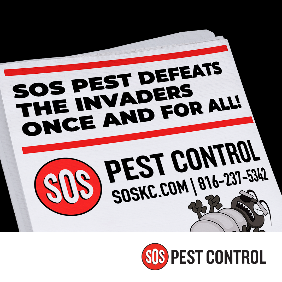
The SOS logo is simple, yet recognizable and effective. The imagery evokes a panic button that clients can press if they are concerned about bed bugs or other pests. The logo was recently updated to a more modern look, derived from the legacy logo that was digitized for SOS in 2008. Because this logo appears on service vehicles, it was important to the client to stay close to the existing brand look. Additionally, KMG refreshed the creative direction with a more detailed, illustrative approach. This SOS refresh provides a great example of how refinement and creativity can give a brand new life.

Before
After
CAMPAIGNS
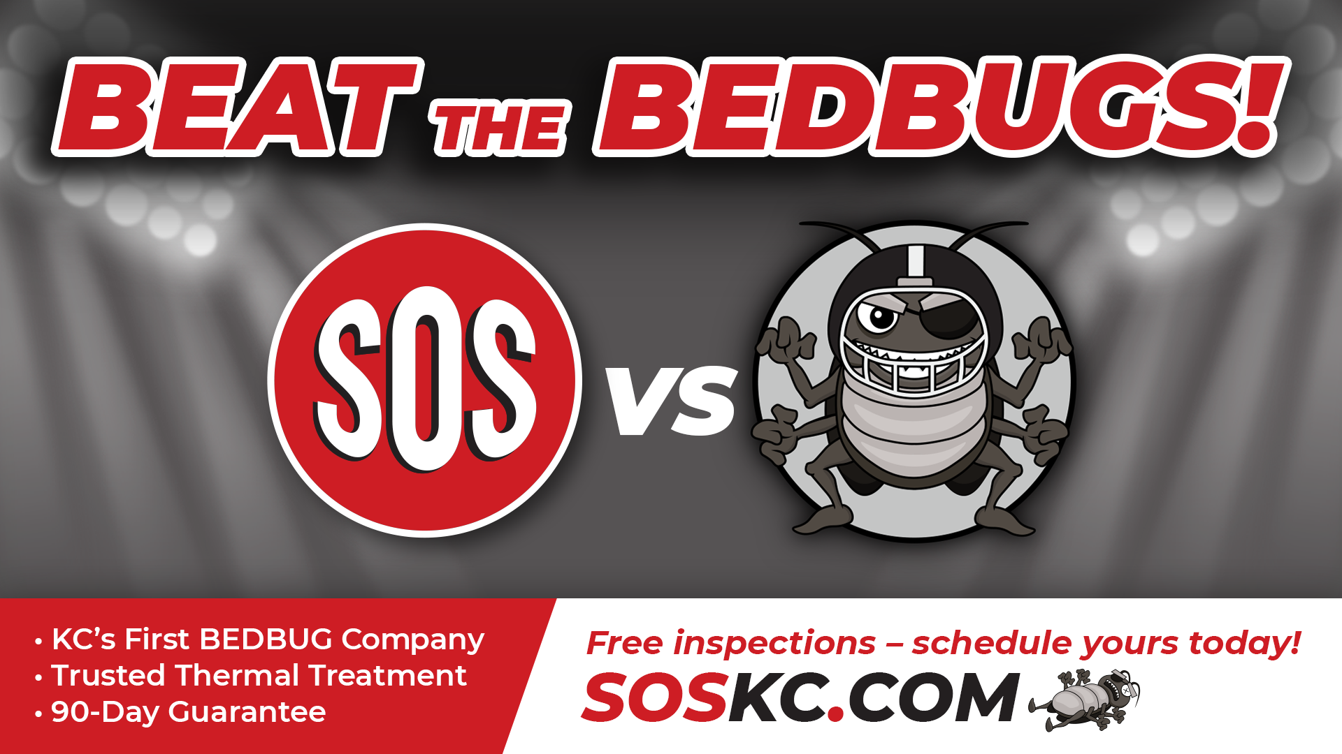
SOS has a strong connection with its hometown of Kansas City. Even their website name, soskc.com, makes this connection. KMG wanted to connect those dots with a fun campaign that linked SOS with the local Sports Heroes in the mind of their customers. The idea of providing the great offensive and defensive game against rival bed bugs was born, with SOS KC, the victorious winners every time. KMG created a multi-faceted, integrated campaign for SOS, including website, TV and social media.
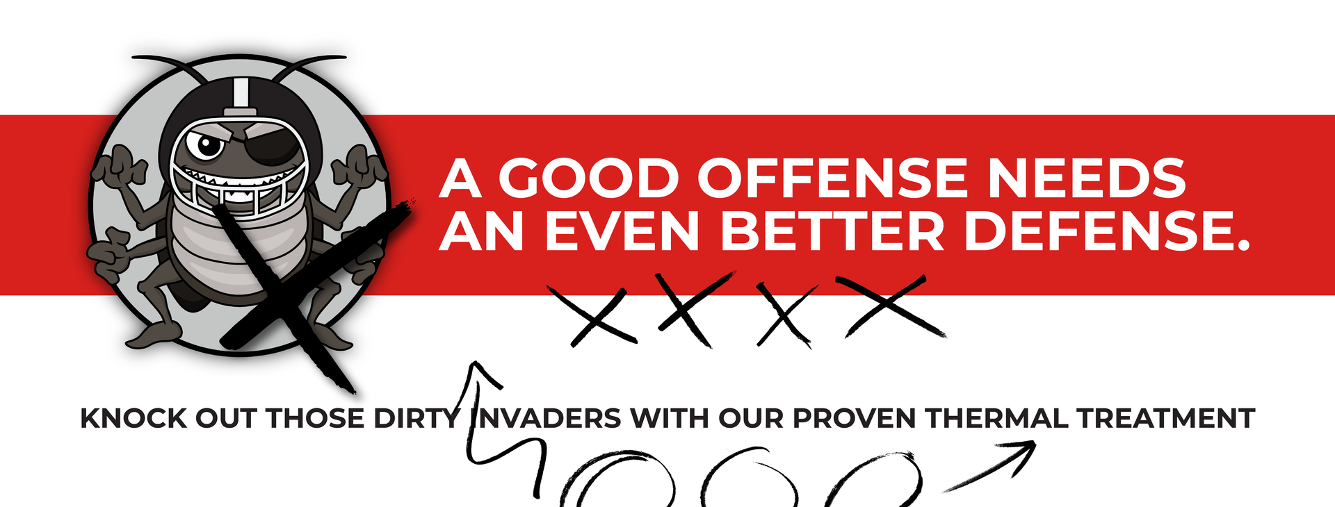
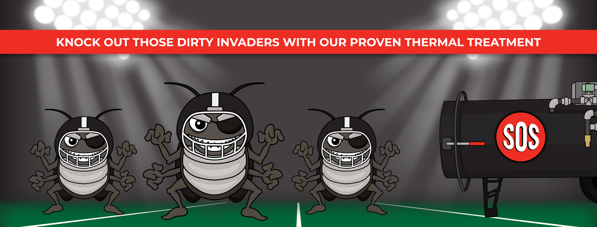


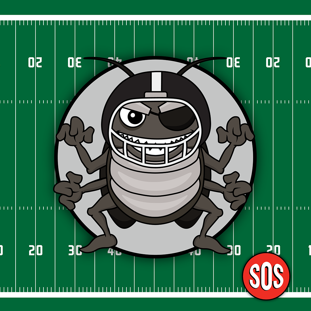
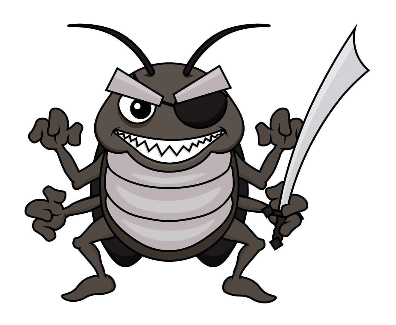
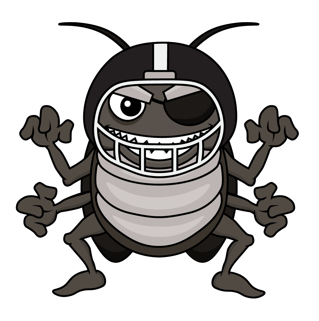
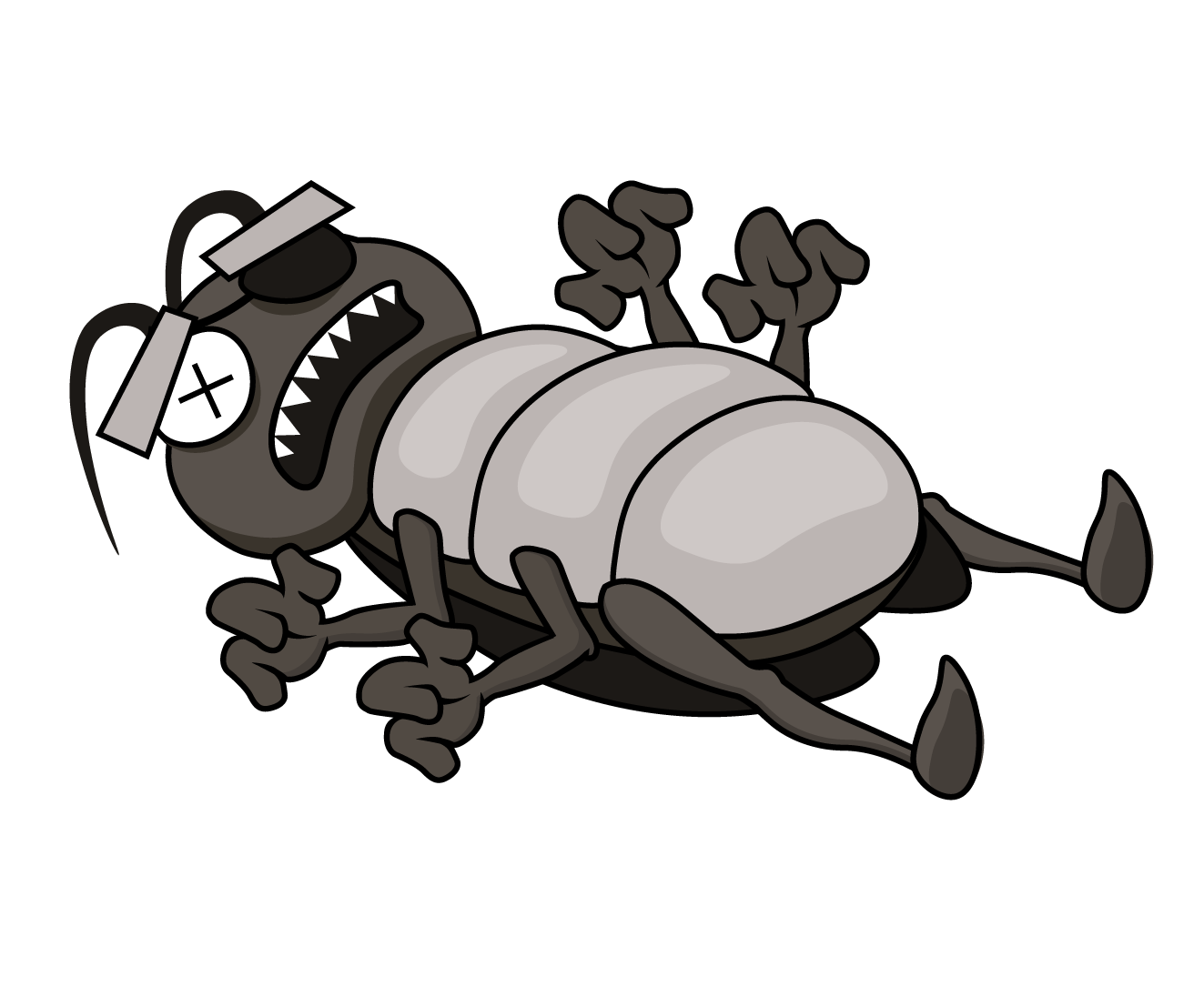
CUSTOM ILLUSTRATION
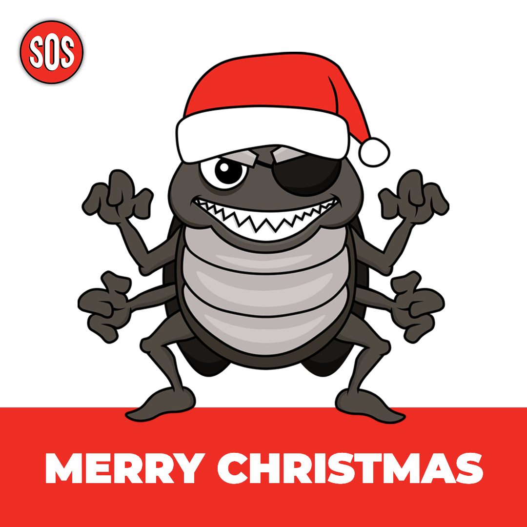
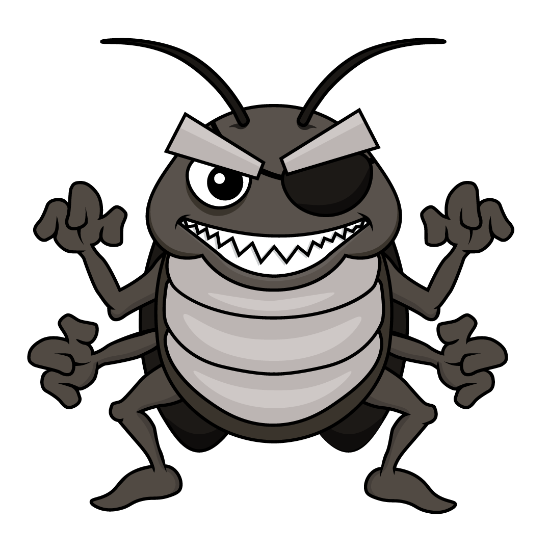
For the Gametime campaign, KMG created customized illustrations of bed bugs -- the "Invaders" -- as the rival team. We also designed fun playing cards for each team member, that are used on the website and in social media to foster a sense of personal connection to the SOS team.


STRATEGY + SOLUTION: SOS FOR THE WIN
KMG's strategy for SOS was inspired by the company's personality and interests. We get to know our clients and come up with creative solutions that represent them well. A cohesive, authentic brand identity is important to customers and shows truth in marketing, which fosters trust, repeat business, and referrals.
GAMETIME TV SPOT #1
Whether you need logo design, campaign development, online ads, web design, marketing strategy, photography – or the whole shebang – KMG will help you reach your target.
KERN, INC.
Unique Entity ID: DJ2TYMD17LL1 | CAGE/NCAGE: 532B8